ADA Site-Wide Checks That Influence SEO Performance
Key Takeaways
- 1 in 4 adults in the US live with a disability, emphasizing the importance of website accessibility for users relying on screen readers, keyboards, and captions.
- Google's Page Experience update continues to prioritize site usability for ranking, with inaccessible sites potentially losing up to 35% visibility in search results.
- Conducting ADA accessibility checks using tools like WAVE can identify issues such as missing alt text or poor contrast, helping improve user experience and search performance.
1 in 4 adults in the United States lives with a disability. This includes users who rely on screen readers like JAWS or NVDA, navigate using the keyboard and the tab key, and people who require captions to follow video content.
In 2021, Google’s Page Experience update made site usability a ranking factor. As of 2025, that hasn’t changed. Pages with poor structure, missing labels, or blocked navigation lose up to 35% of visibility in search results.
However, Americans with Disabilities Act (ADA) accessibility checks can help you find where your site creates friction for users with disabilities. You can use tools like WAVE, which let you plug in your URL and flag issues such as missing alt text or poor contrast. They also show where those same issues may be hurting your search performance.
How accessibility affects UX and on-site behavior
On a Reddit thread about whether or not companies care about accessibility when building their website, one user shared a displeasure about how companies (in the US) hardly do nearly enough.

However, the issue is that you end up leaving a significant amount of traffic on the table due to this oversight.
- Poor heading structure: Screen reader users rely on structure to understand content. The first introduction of said structure on websites lies in the arrangement of their headings. If headings are out of order or are only used to change the text sizes, users wouldn’t be able to move through the page logically.
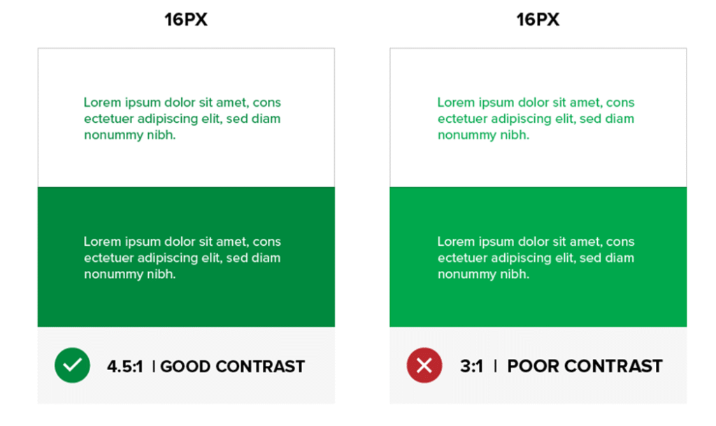
- Poor contrast: Poor contrast also makes content difficult to read, especially on mobile devices. It is a common issue that buttons often blend into the background, or the tap targets are far too small, which turns users off quickly. The side-by-side comparison below is an example of good and poor contrast.

- Lack of alt-text on images: Visually impaired people rely on assistive technologies (AT) to translate non-text content into readable and audible formats. Ahrefs reported that over 80 percent of websites are missing alt text on images. This issue affects both user accessibility and SEO performance.
- Poor CTA label: Even a minor issue, such as a “subscribe” button without a label for screen readers, can prevent someone from completing a purchase. They also cut off parts of your site from search engines. So, with all these issues, what do you do?
How to make your website accessible to improve UX and On-site Behavior
Accessibility helps people use your site with less effort. It also improves how they interact with your content. Here’s how:
1. Clean, semantic HTML = search-friendly markup
When you visit a webpage, you want to find the main content as fast as possible. That’s the same for a screen reader user, but since they can’t just scroll or scan with their eyes, they depend on a structure called semantic HTML.
Tags like <main>, <nav>, and <footer> help people using assistive tech move around a website with ease. They can recognize the main body of the page, the navigational bars, and the footer of the page.
If a website is filled with generic <div> tags (basic containers with no meaning on their own), screen readers and search engines will struggle to understand the structure. And this will make your website inaccessible.
Some sites still use headings (H2s and H3s) solely to make the text appear larger. While it’s visually appealing, it’s not good for your user experience, especially for those who use screen readers to access your web pages.
It will confuse screen readers and search engines as they try to determine which content or heading is more important.
2. Proper headings & ARIA landmarks
Headings are used to guide users and assistive technologies through your content. You’d typically have one main heading at the top and a subheading that follows a clear logical order.
Just as displayed on our homepage:

If the page structure skips around, that is, jumping from an H1 to H4, as seen below, things fall apart. Screen reader users get stuck, bots get confused, and you lose customers.

Instead, here’s what you should focus on:
- Use one H1 per page.
- Follow with H2s and H3s that group related content.
- Avoid using heading tags just to make text bold or large.
- Never skip heading levels. If you jump from H1 to H3, you’re breaking the flow.
3. ARIA Landmarks
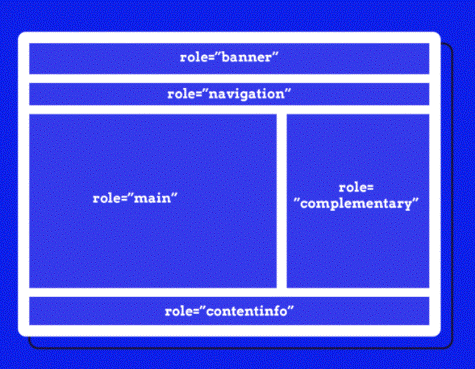
ARIA (Accessible Rich Internet Applications) roles are short labels in your code that help screen readers understand each section of a page. These don’t change how the site looks, but they completely change how it feels for someone using assistive tech.
Without these roles, navigation becomes a trial-and-error process. With them, users can skip straight to the part they want—whether that’s the menu, main content, or a sidebar.
Some of the most useful ARIA landmarks include

- role=”main” tells the reader where the main content starts.
- role=”navigation” tells the readers, “this is a menu.”
- role=”complementary” covers sidebars or bonus info.
- role = “search” highlights your site’s search feature.
- role = “banner” identifies headers that stay the same across pages.
These roles are useful on pages with complex layouts. If a user is relying on keyboard shortcuts, they’re the anchor points. And for your site’s SEO performance, it gives crawlers extra signals to understand how your page is built.
4. Better UX = more time on page and lower bounce rate
Accessible websites reduce friction for users. That means better on-site behavior, more time spent, more pages viewed, and fewer drop-offs. All of that supports SEO because users (disabled or not) will spend more time on your page.
If your body text is light grey on a white background, most users will struggle to read it, especially in sunlight or on a small screen.
With a simple hack, such as adjusting the contrast, increasing the font size, and providing your headings with ample space, your site becomes easier to scan, and visitors stay longer.
This also applies to users with ADHD or visual sensitivity. A clean layout with good spacing reduces the mental effort to figure out what each text is. They don’t have to struggle to focus, so they’re more likely to keep reading or exploring.
Here’s what to do to achieve it:
- Use a legible sans-serif font like Helvetica or Arial.
- Set your base font size to at least 16px.
- Stick to clean, consistent heading structures.
- Maintain contrast ratios that meet WCAG AA standards.
5. Keyboard navigation and usable forms
If your website includes forms, menus, or popups that cannot be accessed with a keyboard, you’re cutting users with motor disabilities off. You will need to provide alternatives that comply with ADA standards.
For example, are your menus, links, buttons, and form fields reachable using just the tab key?
Also:
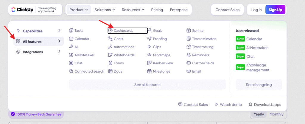
- There should be a visible outline or highlight to indicate where the focus currently is.

In the screenshot above, the focus is on the text “Dashboards,” and it moves further as the user continues to press the “Tab” key. This makes the website (ClickUp) accessible.
- Forms must have properly linked labels and usable error messages.
Try it yourself. Open your homepage, unplug your mouse (or disable your trackpad), and try to book a demo, fill out a contact form, or perform any other action on your website. If that’s hard, users will leave. Some may never come back. Here’s why a video on how to navigate like this is important:
It’s why our web design services focus on custom layouts, SEO-ready structure, and accessibility. We build websites that meet ADA standards to provide web users with a seamless and accessible experience from the start.
6. Add captions and transcripts to videos, audio, and carousels
Autoplay videos without captions are one of the fastest ways to frustrate people. Anyone can catch your new video at the library, at a meeting, or with people who have hearing loss. Adding captions and transcripts makes video content more usable for everyone.
The best part? Captions also help search engines filter what’s important.
It works in a way that allows Google to index the text and rank it for keywords mentioned in the video.
That said, this applies to podcasts, tutorials, and very rich media content. As long as you’re publishing it, caption it. Try out tools like Descript or YouTube Studio to quickly generate captions.
7. Content-level ADA-accessibility checks
Clean content is king, but it only works when everyone can access and understand it. Here’s how to get it right:
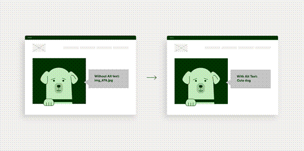
- Add alt text that describes the subject, as seen below:

HubSpot shares some best practices for alt text in their article about how to optimize image alt texts.
- Use headings in the right order. Stick to one H1 per page. Use H2s for sections, H3s for subpoints. Skipping a level confuses assistive technology and disrupts page structure for bots.
- Write link text that explains the section. Replace “click here” with “Download the accessibility checklist” or“view pricing page”. It’s better for clarity and keyword relevance.
8. Layout and structure checks
How your pages are built affects both usability and crawlability.
- Use semantic tags like <main>, <nav>, <footer>. It is not enough to have a visually appealing website if assistive tools and search engines cannot navigate through each section.
With the <main>, <nav>, <footer> semantic tags, you help readers with disabilities understand which part of the page is the main content and which part of the page is the footer.
- Include “skip to content” links. If there are a lot of elements on your website, this helps users save time by bypassing the repetitive elements.
- Apply ARIA roles when needed. Add role= “navigation,” “role=”main,” and so on, especially when your layout doesn’t use semantic tags.
Common Pitfalls and How to Avoid Them
Even with the best intentions, accessibility efforts often fall short because teams focus on quick fixes or rely too heavily on tools. These are some mistakes that affect both user experience and SEO performance.
1. Relying only on automation
Automated checkers like Axe or WAVE can help you identify issues such as missing alt text or low contrast, but they don’t provide a holistic view of what real users experience.
What they don’t detect are things like:
- Headings used out of order.
- Interactive elements without keyboard access.
- Confusing link labels like “Click here.”
- Modals or popups that trap focus.
To catch these, you need manual testing. That means navigating with just a keyboard and using screen readers like NVDA or VoiceOver. And asking people with disabilities to test key user flows.
Here’s an example of a test developers can run on your code to ensure there are proper elements on your page:
<iframe width=”560″ height=”315″ src=”https://www.youtube.com/embed/Js7G9aPKSoY?si=pP03hPlL_skZpvPQ” title=”YouTube video player” frameborder=”0″ allow=”accelerometer; autoplay; clipboard-write; encrypted-media; gyroscope; picture-in-picture; web-share” referrerpolicy=”strict-origin-when-cross-origin” allowfullscreen></iframe>
2. Overlooking dynamic content and third-party tools
Often, I see how third-party tools can break or undo the good work you’ve done on your website because some of these elements update without reloading the page, which can compromise accessibility.
So, if a screen reader can’t detect the addition of new content, or a keyboard user can’t exit a modal, the site becomes unusable. These issues can also affect Core Web Vitals. For example, poor focus handling or hidden content loading can cause layout shifts (CLS), which can make your page unstable when a user is about to use it. This can make your website less user-friendly and negatively affect your rankings.
The Daily Telegraph encountered this issue with ads that loaded after the main content.
As the ads appeared, they pushed everything down, including headings, text, and links. Users lost their spot. Many exited the page before finishing the article. Their CLS scores increased by over 250%. That drop in engagement hurt their rankings and ad revenue until they fixed it.
3. Treating accessibility as a one-time fix
Accessibility is not something you “do once.” Every content update, design tweak, or plugin installation can reintroduce barriers.
If you add a carousel to your home page that scrolls automatically and doesn’t pause when it should, or the slides have no alt text, the accessibility level of that page drops, even if the rest of your site passes audits.
To avoid this, make accessibility part of your ongoing QA and SEO checks:
- Add accessibility review to staging workflows.
- Train your content and design teams to include alt texts on media (images, carousels, videos).
- Set up regression tests using both automated and manual checks.
Accessibility needs to evolve with your site. Otherwise, minor updates pile up, and you lose the trust of both users and search engines.
Conclusion
It is not enough to build a website that is visually appealing if you’re locking out any demographic from accessing it.
Everyone should have access to the full functionality of your website, regardless of how they browse, the devices they use, or the limitations they encounter on a daily basis. This is what a proper ADA (Americans with Disability Act) checklist helps you catch. It brings attention to the friction that slips past surface-level audits, affecting real people and silently impacting your SEO, conversions, and user trust.
